We spend so much of our time in the digital world, scrolling and tapping on smooth glass screens. That’s why when you hand someone a physical object, its texture and weight matter more than ever. Think about the last business card you received. Did you even notice it? A kraft paper card demands to be noticed. Its organic, slightly rough texture is a surprising and welcome change from the norm. It creates a sensory experience, making your introduction more memorable. This tactile connection communicates quality and care in a way a standard card simply can’t. For a brand that wants to feel both modern and grounded, choosing kraft paper business cards New York NY is a powerful way to make your first impression a lasting one.
Key Takeaways
- Let your card tell your brand’s story: Kraft paper is ideal for businesses that value authenticity, sustainability, or a handmade feel, as the earthy material reinforces your message before anyone reads a word.
- Prioritize contrast for readability: Ensure your design is effective on the brown paper by using a clean layout and high-contrast colors like black or deep navy. For extra impact, consider adding a white ink base to make your logo and text pop.
- Select a printer with kraft paper expertise: To avoid a cheap or unfinished look, work with a print partner who understands this unique material. Ask for samples to ensure they can deliver a high-quality, professional card that represents your brand well.
What Are Kraft Paper Business Cards?
When you hand someone a business card, you’re giving them a small piece of your brand. Kraft paper business cards make that moment feel different. Instead of a standard glossy white card, you’re offering something with texture, warmth, and character. At its core, a Kraft business card is made from a special brown paper that has a natural, rustic look, often with visible wood fibers that make each card subtly unique. In a city like New York, where every detail matters, a Kraft card helps you stand out by being understated. It communicates authenticity and earthiness, a simple choice that says a lot about your brand’s values.
The Appeal of Natural Kraft Paper
The charm of Kraft paper lies in its perfectly imperfect, earthy texture. Unlike slick, uniform cardstock, Kraft paper has a tangible, organic feel that people notice. Its natural brown tone provides a warm, inviting backdrop for your design, creating a look that is both rustic and sophisticated. Many people also choose Kraft because it’s an eco-friendly option, often made from 100% recycled materials. This sustainable aspect can be a powerful part of your brand story, showing customers you care about the environment. The result is a beautiful, memorable card that feels both personal and purposeful.
Why New York Businesses Choose Kraft
In a competitive landscape like New York, making a genuine connection is everything. A Kraft business card can be a powerful tool for differentiation. While many stick to traditional designs, a Kraft card’s unique texture and earthy look immediately set you apart. It signals authenticity, craftsmanship, and an attention to detail that resonates with discerning clients. Choosing the right business cards is a key part of your branding, and for many NY businesses, Kraft paper helps tell a story of being grounded, transparent, and thoughtfully curated. It’s a way to make a lasting impression that feels both modern and timeless.
Who Should Use Kraft Paper Cards?
Kraft paper cards are a fantastic fit for any business that wants to project an image of being natural, handmade, or environmentally conscious. Think of artisanal bakeries, boutique coffee shops, florists, custom woodworkers, and organic skincare brands. The paper itself reinforces their brand ethos. However, their appeal isn’t limited to just those niches. Creative professionals like graphic designers, photographers, and writers can use Kraft cards to convey a sense of artistry and authenticity. Even a tech startup or a consultant can use a minimalist Kraft card design to appear more approachable and grounded. If your brand values warmth, craftsmanship, and sustainability, Kraft paper is worth considering.
Kraft Paper vs. Traditional: Which Card Is Right for You?
Choosing the right material for your business card is a bigger deal than you might think. It’s the first tangible piece of your brand that many people will hold, so it needs to make the right impression. The debate often comes down to kraft paper versus traditional cardstock. Kraft offers a rustic, earthy vibe, while traditional cards provide a classic, polished look. Neither is better than the other, but one is likely a better fit for your brand’s personality and message. Let’s walk through the key differences to help you decide which path to take for your next batch of cards.
Sustainability and Eco-Friendliness
If your brand values environmental responsibility, kraft paper is a fantastic choice. These cards are often made from 100% recycled materials and are fully recyclable themselves, sending a clear message that you care about the planet. Unlike many traditional options that are bleached bright white, kraft paper retains its natural, unbleached color. This process uses fewer chemicals, making it a gentler choice for the environment. Choosing an eco-friendly card isn’t just a small detail; it’s a way to align your physical marketing materials with your company’s green initiatives. It shows you’re thoughtful about your impact, a quality many customers appreciate and actively look for in the businesses they support.
Durability and Feel
The way a business card feels in someone’s hand can leave a lasting impression. Traditional cards are often smooth, with finishes ranging from matte to high-gloss. Kraft paper, on the other hand, has a distinctively tactile and rustic texture. You can often see the subtle wood fibers within the paper, which gives it an authentic, organic feel. Don’t mistake this natural texture for weakness, though. Kraft paper is surprisingly durable and sturdy. You can even select thicker stock options to give your business cards a substantial, high-quality feel that won’t easily bend or tear in a wallet, ensuring your brand stays visible.
Cost-Effectiveness
You might assume that a specialty paper like kraft would come with a high price tag, but it’s often quite affordable. While pricing can vary based on thickness, quantity, and special finishes, kraft paper business cards are a cost-effective way to get a premium, custom look. For businesses in New York, the investment is comparable to many standard card options, making it an accessible choice for startups and established companies alike. Think of it not as an expense, but as an investment in a memorable first impression. You get the unique aesthetic and eco-friendly benefits without having to stretch your marketing budget too thin.
The Aesthetic Difference
This is where the choice becomes personal to your brand. Traditional business cards are a blank canvas, perfect for crisp, corporate designs or vibrant, full-color graphics. They project professionalism and versatility. Kraft paper, however, tells a different story. Its natural brown tone creates a warm, inviting, and down-to-earth feel. It’s perfect for artisanal brands, eco-conscious companies, rustic-themed businesses, or anyone wanting to stand out from a sea of glossy white cards. The aesthetic is less about corporate polish and more about authenticity and character. It communicates a sense of being genuine and grounded, which can be a powerful way to connect with your audience.
Finding the Right Printer for Your Kraft Paper Cards
Your business card design is only half the battle; choosing the right print partner is what brings your vision to life. The printer you select can make the difference between a card that looks cheap and one that feels premium and professional. When it comes to a unique material like kraft paper, finding a printer with the right experience and equipment is key to getting a result you’ll be proud to hand out.
What to Look for in a Print Partner
When you’re searching for a printer, start by looking at their experience with kraft paper. Ask to see samples of their work or check their online portfolio. A printer who specializes in this material will understand its unique texture and how ink interacts with it. You should also look for a partner who uses high-quality, durable paper stock. This ensures your cards won’t feel flimsy and will properly represent your brand’s commitment to quality. A great printer acts as a true partner, offering guidance on your design and ensuring your custom business cards make a fantastic first impression.
Understanding Pricing and Turnaround Times
Pricing for kraft paper business cards can vary based on several factors, including the quantity you order, whether you print on one or both sides, and if you add any special finishes. While it’s tempting to go with the cheapest option, remember that price often reflects quality. It’s helpful to get a quote that breaks down the costs so you know exactly what you’re paying for. Also, be sure to ask about turnaround times. Most printers offer standard and rush options, so you can choose a timeline that fits your schedule and budget. Planning ahead can often save you money on rush fees.
Why Quality and Expertise Matter
The tactile nature of kraft paper is one of its biggest selling points. A high-quality card feels substantial in someone’s hand, instantly communicating a sense of care and professionalism. An expert printer knows how to achieve the best results on this absorbent, textured paper. They can advise you on which colors will appear vibrant, how to use white ink effectively for contrast, and whether your design is optimized for the material. This expertise is crucial because it ensures your final product looks intentional and polished, reinforcing the eco-friendly, rustic, or handmade values your brand wants to project through its marketing materials.
How to Customize Your Kraft Paper Business Cards
Kraft paper is more than just a background; it’s a design element in itself. The fun begins when you start thinking about how to make these cards uniquely yours. From the shape of the card to the finish of the ink, there are plenty of ways to create a memorable first impression. Let’s walk through the key customization options that will help your brand’s personality shine through. Thinking about these details beforehand will make the design process smoother and ensure you get a card you’re excited to hand out.
Size and Shape Options
While the standard 2″ x 3.5″ rectangle is a classic for a reason, don’t feel limited to it. A square card, like a 2″ x 2″, can feel modern and bold, immediately setting you apart from the stack. If you want to get even more creative, you can explore custom die-cut shapes that reflect your brand, like a coffee cup for a café or a leaf for a landscaping business. The size and shape of your card are the first things people notice, so choosing something that aligns with your brand’s vibe is a great starting point for your design.
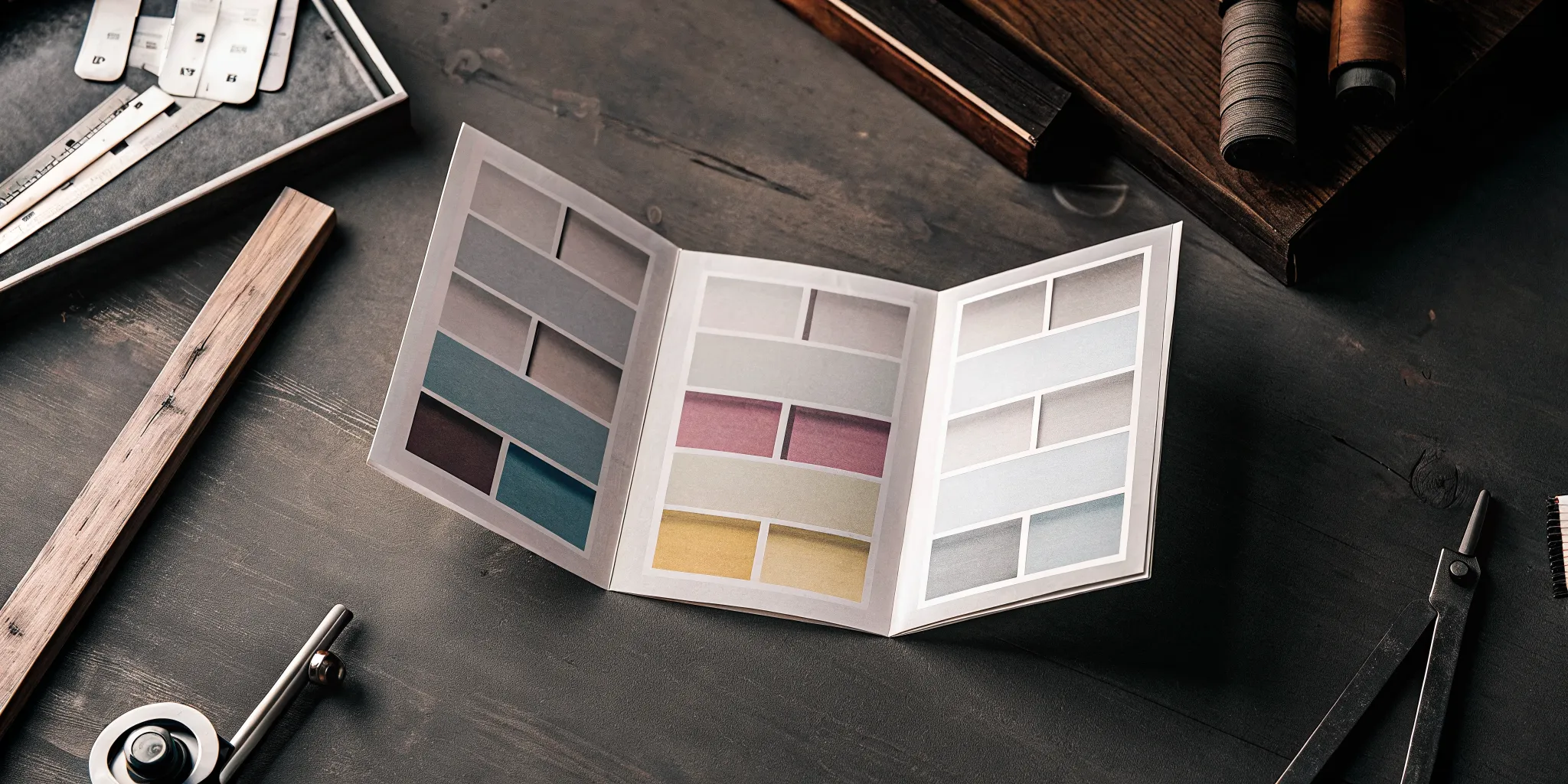
Printing in Color on Kraft Paper
A common question is whether you can print in color on kraft paper, and the answer is a definite yes. You can opt for full-color printing on one or both sides of the card. The natural, earthy tone of the paper will give your colors a slightly muted, rustic quality, which can be a beautiful effect. If you want your brand colors to appear exactly as they do on a screen, you’ll want to consider using a white ink base, which we’ll cover next. This versatility allows you to create a full range of marketing materials with a consistent, cohesive look.
Using White Ink for Better Contrast
To make your design truly pop, especially if you’re using lighter colors, printing a layer of white ink underneath your main design is a fantastic technique. This process, sometimes called a ‘white mask,’ creates an opaque base on the brown paper. When you print your colors on top of this white layer, they appear brighter and more vibrant, providing excellent contrast and readability. It’s also the perfect way to incorporate pure white text or logo elements, ensuring they look crisp and clean instead of getting lost in the paper’s texture.
Adding Special Finishes: Foil, Embossing, and Die-Cuts
Special finishes can add a tactile and luxurious element to your kraft cards. Foil stamping applies a thin layer of metallic foil to specific parts of your design, like your logo or name, for a brilliant shine. Embossing creates a raised, 3D effect on the paper, adding texture that people can feel. Similarly, debossing presses a design into the card. These details make your business cards more of an experience than just a piece of information, encouraging people to take a second look and remember your brand.
Choosing Between Single and Double-Sided Printing
Deciding whether to print on one or both sides of your card often comes down to how much information you need to share. Single-sided printing is a great, budget-friendly choice if you prefer a clean, minimal design with just the essentials. However, using both sides gives you valuable extra space. You can use the back for a list of services, a map to your location, a special offer, or simply your logo. This approach lets you keep the front of your card uncluttered while still providing all the necessary details to a potential client.
How to Design a Kraft Paper Business Card That Works
Designing for kraft paper is a little different than designing for a standard white cardstock. The paper itself, with its natural texture and warm brown tone, becomes an active part of your design. Instead of trying to cover it up, the best approach is to work with its unique character. A successful kraft paper business card balances simplicity with high-impact details to create something truly memorable. This means thinking about your design not as something you place on the paper, but something you create with the paper. The goal is to make the card feel intentional and cohesive, where the rustic material and your branding work together seamlessly.
The key is to focus on contrast and clarity. Because the paper is darker, your color and font choices are critical for readability. A clean, uncluttered layout allows the rustic feel of the paper to shine through, making your brand appear grounded and authentic. This is your chance to make a statement about your brand’s values, suggesting an appreciation for quality, nature, and simplicity. By following a few core design principles, you can create a card that not only looks beautiful but also effectively communicates your essential information and makes a lasting impression on everyone who receives it. It’s about creating a tactile experience that people remember long after the conversation ends.
Modern Design Trends
The biggest trend in kraft paper card design is leaning into the material’s natural, earthy vibe. These cards stand out because their visible wood fibers give them a warm and authentic feel that you just can’t get from a glossy, plastic-coated card. Designs that embrace this are the most effective.
Think simple, organic, and rustic. Hand-drawn illustrations, minimalist logos, and nature-inspired patterns work beautifully. The goal isn’t to create something slick and corporate; it’s to create a card that feels personal and genuine. This approach helps your brand feel more approachable and memorable, making your business card a conversation starter rather than just a piece of contact information.
Choosing the Right Fonts and Colors
When working with kraft paper, high contrast is your best friend. The natural brown tone of the paper can absorb lighter colors, so you need to choose fonts and colors that stand out. Dark, bold colors like black, deep navy, or forest green provide excellent readability and create a classic, professional look. Simple, clean fonts work best, as overly ornate typefaces can get lost in the paper’s texture.
For an even bigger impact, consider using white ink. A layer of white ink beneath your colored design can make your graphics and text pop, creating a striking visual contrast that’s impossible to ignore. This technique is perfect for ensuring your logo or key information is the first thing people see. Avoid pastels or light colors unless they are printed over a solid white base.
Creating a Clean and Minimal Layout
With kraft paper, less is truly more. The unique texture of the paper is a design element in itself, so you don’t want to clutter it with too much information or too many graphics. A clean and minimal layout is the most effective strategy. By using plenty of negative space (the empty areas around your text and logo), you allow the essential elements to breathe.
This minimalist approach does two things: it makes your contact information incredibly easy to read, and it projects an image of confidence and clarity. A simple layout highlights the rustic elegance of the kraft paper, reinforcing a brand identity that is authentic, focused, and intentional. Let the paper do the talking and keep your design straightforward and impactful.
What Information to Include
A business card’s primary job is to connect you with others, so clarity is key. Stick to the absolute essentials to keep your design clean and effective. Your card should always include your name, your title, your business name, a phone number, and your email address. A website is also crucial for directing people to learn more about what you do. If a specific social media platform is central to your business, you can include a handle for that as well.
Resist the urge to add long taglines or paragraphs of text. Let your card’s simple, high-quality design speak for itself. When you partner with a professional printer, you can trust that your information will be printed crisply on high-quality, eco-friendly paper, ensuring all your marketing materials look polished and professional.
Common Design Mistakes to Avoid
A few common design missteps can prevent your kraft paper business cards from looking their best. The most frequent mistake is using low-contrast colors. Light grays, yellows, and pastels tend to fade into the brown paper, making your text difficult or even impossible to read. Unless you plan on printing a white ink base layer, stick to dark, bold colors.
Another pitfall is overcrowding the card. Trying to fit too much text or too many graphic elements onto the card will make it look messy and unprofessional. Similarly, avoid using fonts that are too thin or overly decorative. These can become illegible on the textured surface of the paper. A simple, clean design with a clear, readable font will always yield a better result.
Are Kraft Paper Business Cards a Good Choice for Your Brand?
Deciding if kraft paper is right for you comes down to your brand’s story. These cards have a distinct personality that’s earthy, authentic, and warm. If your business is built on natural products, handmade goods, or sustainable practices, a kraft card can be a perfect extension of your brand identity. Think of artisans, organic cafes, florists, or any business that wants to project a rustic and environmentally-conscious image. The textured, brown paper stands out from the usual glossy white, making a memorable first impression that feels genuine and grounded.
Beyond the aesthetic, choosing kraft paper sends a powerful message about your company’s values. These cards are often made from 100% recycled materials and are fully recyclable, which immediately shows potential clients that you care about the planet. Consumers are increasingly drawn to sustainable businesses, and this small choice can speak volumes. It’s a simple way to align your marketing materials with your mission and attract customers who share your commitment to environmental responsibility.
However, the rustic charm of kraft paper depends entirely on the quality of the print. A design that looks great on screen can fall flat if not printed correctly, turning your intended rustic-chic look into something that just looks unfinished. This is why selecting a skilled print partner is so important. You need a printer who understands how to work with this unique material, ensuring your text is crisp, your colors are balanced, and the final product feels professional. Ultimately, the right business cards will reflect the quality and care you put into your own work.
Related Articles
- Kraft Business Cards – Print It
- Easily Upload Designs for Your Kraft Business Cards
- Business Cards
- Business Card
- Business Card
Frequently Asked Questions
Will my brand colors look strange or faded on brown Kraft paper? This is a great question because it gets to the heart of designing for this material. Your colors won’t look faded, but they will appear more earthy and muted because the brown tone of the paper shows through. Think of it as a natural filter. If you want your colors to look bright and exactly as they do on a screen, you can print a layer of white ink underneath your design. This creates an opaque base that makes your colors pop with fantastic contrast.
My business isn’t ‘rustic.’ Can I still use Kraft paper cards? Absolutely. While Kraft paper is a natural fit for artisanal or eco-friendly brands, its appeal is much broader. A clean, minimalist design on Kraft paper can make a tech company or a consultant feel more grounded and approachable. The paper communicates authenticity and thoughtfulness, which are values that resonate in any industry. It’s less about a specific “rustic” style and more about projecting a sense of genuine character.
What exactly is white ink, and is it necessary for my design? Think of white ink as a primer you’d use before painting a dark wall. It’s a layer of opaque white ink that a printer can put down on the brown paper first, before printing your color design on top of it. It isn’t always necessary, but it’s the best way to make sure your colors look vibrant and that any white text or logos in your design are crisp and easy to read. Without it, lighter colors can get a bit lost against the brown paper.
Are Kraft paper cards as durable as traditional business cards? Yes, they are surprisingly sturdy. Don’t let the natural, organic feel fool you into thinking they are flimsy. Just like with traditional cardstock, Kraft paper comes in different thicknesses, or weights. When you choose a quality, thick paper stock, your business cards will have a substantial, premium feel that won’t easily bend or get damaged in a wallet. The tactile strength of the card reinforces the quality of your brand.
Does choosing a special paper like Kraft cost a lot more than standard cards? You might be surprised to learn that Kraft paper business cards are often very cost-effective. While the final price depends on factors like quantity and any special finishes you add, the base cost is frequently comparable to many standard white cardstock options. It’s an accessible way to get a unique, custom look that makes a big impression without requiring a huge marketing budget.